December 4, 2014
How to display correlation between symbols
For the purpose of calculating the correlation between two data-arrays, there is a Correlation() function in AFL which can be used.
In order to display a correlation chart, please select Analysis–>Formula Editor menu and enter the following code:
SetChartOptions( 0, chartShowArrows|chartShowDates);
Ticker = ParamStr( "Symbol", Name() );
range = Param( "Periods", 252, 2, 500, 1);

corr = Correlation( Close, Foreign( Ticker, "C"), range );
Plot( corr, "Correlation " + Name() + "/" + ticker,
      ParamColor( "Color", colorRed ), ParamStyle( "Style", styleLine ) );

// check if different symbols are used
if( ticker == Name() )
    Title = "Please select different symbol from Parameter dialog"
Now select Tools->Apply Indicator. Initially the code will pick the selected symbol’s Close prices for both arrays, so we either need to change the selected ticker in the chart or the second symbol, which can be defined in Parameters dialog.
We can also use Exploration feature to display a correlation matrix e.g. for the watchlist members. The below example shows the process for Watchlist 0 members.
The formula to display correlation table looks as follows:// read the list of symbols from Watchlist 0
symlist = CategoryGetSymbols( categoryWatchlist, 0 );
// display only last bar from the Analysis range
Filter = Status( "lastbarinrange" );
// iterate through symbols
for ( i = 0; ( sym = StrExtract( symlist, i ) ) != ""; i++ )
{
// calculate correlation over 252 bars
Corr = Correlation( C, Foreign( sym, "C" ), 252 );
// set color dynamically based on correlation values
// and display the output in exploration column
Clr = 32 + SelectedValue( Corr ) * 32;
AddColumn( Corr, sym, 1.2,
ColorHSB( 128 + Clr, 255, 255 ),
ColorHSB( Clr, 255, 255 ) );
}
SetSortColumns( 1 )
To use the formula we need to do the following:
- assign some symbols to watchlist 0
- select Analysis->Formula Editor menu
- in the AFL Editor enter the code listed above
- select Tools->Send to Analysis menu
- in the Analysis window, select Apply to: Filter (in Include tab hit Clear and pick watchlist 0)
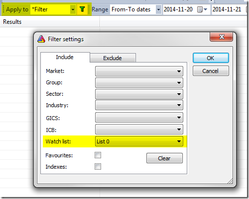
- select Range: 1 Recent bar (in case of longer range, last bar of the range will be used for output)
- press Explore button

Here is a sample output table:
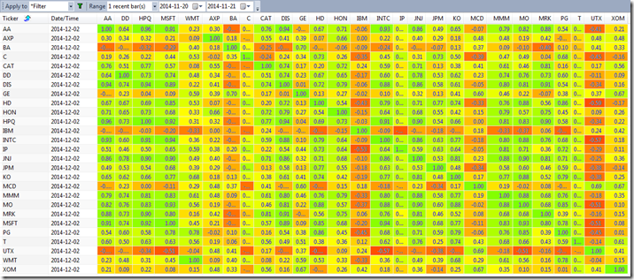
Be careful and try not to put 10000 items in the watch list because it would need to create a table with 10K columns. Windows has some limits on pixel width of the list view and it would truncate display when the display width (scrollable area inside list) exceeds 32767 pixels. That makes it practical only to display matrices of not more than about 1000-2000 columns.
 Filed by Tomasz Janeczko at 5:59 am under Exploration
Comments Off on How to display correlation between symbols